Welcome everyone, to the next season of Throwback Thursday, Michiko & Hatchin! I hope you’re all having a great Thanksgiving. I hope I am, I’m writing this a few days in advance. We have a lot to talk about with this new series, and not a lot of time to do it, so lets jump right into it!
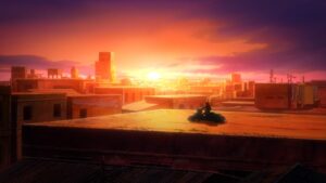
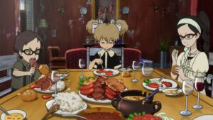
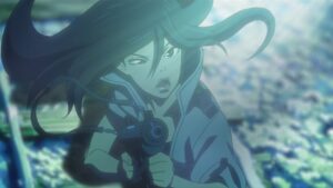
Starting off, lets talk production. I’m very split on how Michiko & Hatchin looks. The backgrounds are absolutely gorgeous, no question there. Whether it be the cheap “rich” inside of the priests house, with its fraying wallpaper contrasting the rich furniture, or the detailed and dirty city streets and all the graffiti present on the walls, it looks great. It’s been awhile since I’ve seen a world so fully realized as this through just its background art alone. But the rest of the visuals… Something feels off. Michiko herself is fantastically animated at times, from the wind blowing through her hair as she rides her bike to her various gunfights. But something about Hatchin’s design, her face, the proportions, all feels off to me. Maybe I’ll get used to it with time and it won’t be an issue, but this early on there’s definitely something off putting about it.


