Window Horses (2016) Movie Review – 87/100

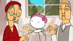
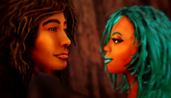
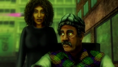
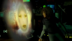
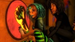
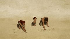
In Window Horses, or its full name Window Horses – The Poetic Persian Epiphany of Rosie Ming, many characters keep asking the main protagonist, a Stick Girl in an otherwise fully formed character designs, why is she wearing a chador, in which she’s unable to reply. It’s her first trip to go overseas, so she just tries to fit in. For she’s blank state, you see, having little to no idea about the outside world, or even the poetry world. Rosie Ming, her name – herself a half-Chinese half-Persian who living in Canada, working in a fast food restaurant while writing poems (to be more exact, singing poems) as her hobby. She self-published her first book title “My Eye-full Poems by a person who has never been to France” and her greatest wish is to travel to France, the land of love and poetry. God listens to her well it seems, as she receives an invitation to attend to a poetry festival… in Shiraz, Iran. Throughout the course of the film, in a stranger land, she has a chance to listen to the voices of others, to staying open and curious with different cultures from different generation and learns a bit about herself and her family situation.

There’s one thing I can say for sure, Window Horses’ most obvious charm come from the fact that it feels like nothing else you’ve seen, especially in animation medium; the film whose main setting is in a poetry festival, a main character that is multiracial and the cast contain characters from many different backgrounds. Partly due to its unique appeal, the director Ann Marie Fleming had a bit of difficult time funding it, so she decided to crowdfund the project instead and it took her nine years to finally bring this lovely feature to life. The main character Rosie, a Stick Girl, has been the director’s own avatar for most of her career (the director herself is a half-Asian), and her simple design, both mean as a blank page, who despite not having a lot of experience, goes out to the world with curiosity and willingness to learn the world and all the things she can from other people; and as a simple likable character we can all root for and feel empathy with.

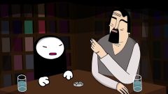
While the main plot is about Rosie visiting Iran, Window Horses isn’t strictly about her tale, but she serves as our window for the tales of other poets, the tale of Iran, and the tale of her father, who she come to believe that he had abandoned her and her Mom when she was young. Putting together, those tales are messy and over the place, but that is exactly the point to demonstrate how inspiration can come from every corner of the world; it’s the love of art, of poetry that brings those people who have vastly different ethnical backgrounds and different experiences in life all together. In one of her poetry quest, she is handed a poem by a Chinese poet Di Di (in Mandarin of course), who requested her to recite his poem in English with her own take. In order to do that she has to translate them into Persian, and then from Persian to English; thus in a process she has a chance to learn more about both of her ancestors, the Chinese and the Persian.

The humor of Window Horses is on the bright side here, in fact, its whimsical and light-hearted nature really help strengthening the mood and the theme of the story. This trip, after all, is more like an adventure for Rosie, where every new thing she learned, every people she met brimming with curious eyes. She quickly remarks in most of the things, mostly innocent deadpan questions like “How is it everyone here knows everything about everything”. The struggles she experienced for her “offensive content” to the Persian culture, for example (ya know, in Iran, solo performances by women is considered mildly offensive and have been banned), or the background story of exiled Chinese poet Di Di, both show us the difference in cultural perception, and add the richness to this little world.

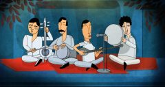
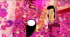
Another main portion of the film is about each poet reciting their poems, and the history of Iran and important figures in Persian poetry culture, in which each part is showcase of visual inventiveness from different directors, who experiment with new styles to fit the content of the poems they are representing. (Fleming’s main job in those segments was to composite them into a cohesive whole). The history part doesn’t really sell it for me, mostly because it feels more like an educational Discovery Chanel on TV rather than fitting into this plot’s content; but the poem parts are easily one of the best strength of Window Horses. The director Fleming gave a smart decision to have all the poems reciting in their own languages without the subtitle. As a result, us as viewers don’t really understand what they’re talking about, but feel it. It’s the beauty of poetry. It’s not about the meaning, but the rhythms. Fleming also commented later in her interview that she wanted those poems to be some kind of code, viewers don’t need to understand it because they might get distracted from the main story, but if they wanted to, they can dig deeper to those contents because ther’s a whole world of art buried underneath it.

And then her little story about her parents, especially her father’s life come into light and was told to her by different people, most of them have known him at some point of his life. Her father’s backstory come a bit heavy-handed at times as it again touches upon the Iran Revolution and the refugees, but they do it without the expense of emotional drama of familial bond at its heart, so as messy as it is, it has its merits. Rosie’s grandparents, voiced beautifully by Nancy Kwan and Eddy Ko (If you have no idea who Nancy Kwan is, she was one of the first Asian-born actress played a pivotal role in the acceptance of actors of Asian ancestry in major Hollywood film roles) have some really great scenes of overprotective grandparents who must do anything to avoid their kid getting hurt, but hurts her instead by not telling her everything.

Wildly imaginative, sensitively portray the richness of multi-cultures and the love for poetry, at the same time bright and optimistic enough to bring hopeful sentiments to some otherwise grim and dark topics and a full delight from start to finish, Window Horses is a total winner in my book. Although feature a wide array of cast, it’s ultimately a personal story of Rosie to reach the world, learn few new things from other, appreciate more about her backgrounds and grown into her own at the end. Window Horses is a little story that worth telling.

Some notable Animated Music Videos of 2016- part 3

[slideshow_deploy id=’21251′]

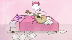
With this last part, we will head for more energetic offerings from last year. Be sure to get in the lively mood and the trippiness of those videos. Fasten your seatbelt and enjoy the ride. A bit of caution here as these videos are mild NSFW.

Caravan Palace “Lone Digger” by Double Ninja

“The choice of the title started as a joke while exchanging emails with our manager and we liked the modern touch immediately. Our good old robot as an emoji <I°_°I> ! We communicate a lot via email and text messages, so it actually took us a while to realise it could be a problem pronouncing it. But it’s fun to puzzle people a bit, even your direct partners: label, PRs, distributors… Somehow it started to be called “Robot” or “Robot face” on the net but that was never our choice. (The band commenting on the title of their new album <I°_°I>, since I couldn’t find any interviews regarding the video. For whatever reason a video this popular and the band this socially active didn’t have any single mention is beyond me).

Okay, I’m a bit cheating here as this video was released in late 2015, but I know it when I saw it, this video has to be up here on this list. I’m not beating around the bush, Lone Digger video is one of the most impressive production. Everything here is top-notch, the music is great- the French band Caravan Palace is one of the most prominent electro-swing band today; just listen!), the video kicks ass- they created the mood of the club that go so well together with the song, and they managed to turn up a notch into a bloodbath of the lawless. But the video speaks some of the truth as well. Aren’t we, human, when get drunk and high, becoming some sort of wild animals? This video brings an absolute amazing energy that surely will make your blood pumping and your heart racing.


Savern “Hendrix” by Airplan Studio

Regrettably, I can’t find any interviews regarding the making of this video. Might have it in Hungarian, where the band and the animation company are based, but again that out of my reach.

Wildly imaginative, cinematic, and just plain entertaining to watch, this video gives a lovely tribute to classic rock music, classic western movies and the post apocalyptic world that suddenly become popular in recent years (no small thanks to Mad Max Fury Road). Let’s face it, this world building is so cool that you could make a movie revolve around this settings (Actually they did raising funds for another project based on this settings, which sadly failed). The story is a trip to madness where the world is suddenly invaded by the alien that could make people hallucinating. There’s the green liquid that can keep people in check but with all the supply is now gone, our “Man with No Name” version becomes more and more out of touch with the reality and get himself more into the world of Jimi Hendrix. The CG animation mostly keep up with the theme but the art settings of the post apocalyptic world are the real winner here. Moreover, this video never forgets to be fun and as a whole, this is a must watch for any fan of classic rock music and movie lovers.

Continue reading “Some notable Animated Music Videos of 2016- part 3”

Some notable Animated Music Videos of 2016- part 2

[slideshow_deploy id=’21036′]

This part offers even more diversity in animation techniques, as well showcase the varied genre of songs. Let’s get right down to it.


Lorn “Anvil” by GERIKO

“He allowed us to choose one track from his latest album and gave us full creative freedom to explore and develop bot the narrative and the aesthetic of the piece. It was a great privilege to be awarded so much trust and creative licence by an artist we deeply admire” – GERIKO

Hands down the most ambitious and ambiguous video out of this list. Inspired by Japanese and Belgian comics, most notably Akira, Ghost in the Shell and the Matrix, Helene Jeudy and Antoine Caëcke (aka GERIKO) created a an incredible science fiction universe in a brilliantly stylish black-and-white animation for Lorn’s song “Anvil.” In this dystopian future in which social networks can manifest in physical ways, invade the body and mind and blow them wide open, a young woman chooses to take her life via a machine and we see every bit of process that she emerges herself to that crazy world there. The subsequent journey our main character embarks on is exquisitely detailed, mesmerizing, and truly compelling visual.


Jane Bordeaux Band “Ma’agalim” by Uri Lotan

“The inspiration came from a visit a few years back at Musée Mécanique in San Francisco, a museum devoted to antique penny arcade machines. Walking around the museum there was a feeling that time had stopped. The characters inside the machines have been destined to a never ending cycle repeating the same action over and over again. That metaphor worked perfectly with the lyrics.” – Uri Lotan

“Ma’agalim was conceived in an untraditional way. We contacted the band with the intention of creating them a music video. That gave us complete creative freedom, as long as it was in the spirit of the song.”

I’m gonna be honest, this video melted my heart for its beautiful, detailed yet bittersweet feelings it evokes and the fresh and innovative approach for its story. Ma’agalim is a Hebrew word for “circle”, and as the creator mentioned above this is precisely the theme with this video. We see the characters running in circle, getting stuck in a very specific and endearing place, but that’s why this video has a feeling of timelessness. The video centers around an enchanting, innovative CGI animated wooden penny arcade, packed with as many beautifully designed and whimsy characters. As the arcade rotates and our little girl wanders around, the internal workings of the machine are revealed, showing how it brings an everyday life of those characters in that penny arcade world. An intricately designed, beautifully-executed, and gently poignant achievement in CGI. Many people even go so far to compare this video to the worlds of Pixar for good reasons. My personal favorite pick.

Continue reading “Some notable Animated Music Videos of 2016- part 2”

Some notable Animated Music Videos of 2016- part 1

[slideshow_deploy id=’21012′]

Welcome to the special edition of World Animation where this time I will dig into the doomed child of animation market: the animated music videos. If you have never really give much thoughts about those animated music videos, you’re not alone. It’s the section that hardly get discussed both in the anime fanbase and in the cartoon market, and my guess is that apart from a niche audience who follow music video and the professionals: animators and the bands alike, no one hardly know anything about it.

Animated music videos of course have a totally different approach to animation compare to short films or series, in which not only you have to make the video compelling on its own, but the animation has to support and elevate the song. That mean, you can’t pull off something like this (in which the song is clearly about being there for someone you love, even if she is “beauty queen of only 18”, but the video was about the love affair between the guy and his girlfriend’s mom. Yuck. AND IT WAS A FREAKING HIT). But here’s where it gets interesting: Animated music videos usually carry a strong artistic expressions than other media. The whole process of animating a music video (at least for indie scene) is that the band sends the director/ animator their song and some ideas on the concept of what they want in the video, then they basically leave the rest to the director. That process results in the creators have their full artistic control most of the time, thus the outcome usually one of the more striking piece of animation than the rest of animation medium.

In fact, while compiling this list, I came to a rather surprising realization: I had no setlist as a point of reference at all. There were some sites that recommend some animated videos, but the videos were all over the place; and there was no “best of list” or whatever; as a result I had to come up with the most traditional way: watching all the videos I could get my hands on to do this list. Yup, it means watching 40+ of those videos until all of them just blended and melted in my brains. But I have to say, except from the time consuming and the fatigue it caused me, it was actually a very rewarding process. Then the list I was compiling just kept getting bigger the more I watched, to the point I had made a line somewhere (otherwise I would recommend everything).

So ladies and gents, here are my 15 favorite videos out of last year from multiple music genres, with multiple animated techniques where I will address about their core concept, the style of animation they use, and how they are stand out from the rest. Really, if you have 20 minutes of break, why don’t you listen to some cool music and watch some stunning animation and gain some insights about them in the process? It’s just an episode worth of time anyways, and many of the videos just clock in at 1 minute. So watch them guys and comment which videos you like the best, or even if you like to see this kind of content every now and then; I’m fully aware this is an anime blog so it’s your call. Enjoy!


Porter Robinson & Madeon “Shelter” by A-1 Pictures

“I knew I wanted to do an anime, animated produced video in Japan. I wrote the story that happened to connect pretty brilliantly to the lyrics of Shelter. To me the Shelter video is also a story of familial love mixed with some of my own fantasies and sensibilities… There’s a significance that can be derived—passing yourself onto a new generation.” – Porter Robinson

Many of you sure have heard about this one. An original anime music isn’t something new, but for a American DJ artist who specifically requested his song to be anime-style, you know you’re in something special. As a matter of fact, the staffs of A1-Pictures had noted that the most special aspect of the production was to witness the enthusiasm of Porter Robinson about the project. For the records, I have watched Porter Robinson other videos and yup, this guy knows how to tell a good visual storytelling. Moreover, for a medium that focus prominently on mood-building and work mainly as a visual companion for the song, it’s a treat to see some video that actually attempt to tell a complete story (as you will see below, most of the time they don’t bother to try); but Shelter also pulled off an emotional ride, with awe inspiring world building and impressive animation to boost (A1 Pictures did an excellent job). This is clearly a passion project and passion project is always a winner in my heart.


Radiohead “Burn the Witch” by Chris Hopewell

“The band wanted the video to raise awareness about Europe’s refugee crisis and the “blaming of different people… the blaming of Muslims and the negativity” currently engulfing European politics”- Virpi Kettu (the video animator)

Paying homage to The Wicked Man in terms of plot and the 1960s British children’s TV programme Camberwick Green in term of its visual, the video’s stop motions character designs and settings are seemingly the most simple and brightest video out there, but the music and the subject matter make it a very unsettling atmosphere (the band purposely want the video to be lighter to what they play to “wake people up”). The topic at hand is about burning the witch after all. Radiohead is no stranger when it comes to building a paranoia mood, and this video helps raising that comfortableness to a new level. Like in Lynch movies, there’s always a sense of something hideous, decay, something really wrong right underneath the normal happy rural life. The video serves as a response against authoritarianism, some even go so far to say it as an attack against Trump’s right-wing policies. And with that paranoia mood they evoked, I believe the song pretty much nailed it.

Continue reading “Some notable Animated Music Videos of 2016- part 1”

Strange Frame – Love & Sax (2012) Movie Review – 76/100

Hooray, I’m finally back to this section after a while. I originally plan to review a more in-focus groups of animated films, like Korean movies, anthology movies, female-directed films, etc but now I have a different plan. The days that I cover all these will come, I promise. Instead, this time I want to highlight the very spirit of World Animation- take you around the world to check out a diverse set of animation techniques in wide ranges of genres. As I mentioned before the very purpose of this column is to recommend you readers to check out those movies as an alternative to anime and mainstream animated movies, so don’t feel discouraged to read on the review if you haven’t seen these movies. There will be mild spoilers on the theme of the movies, but I don’t see it as an issue should you guys decide to check out these films later.

The title this week: Strange Frame- Love & Sax sold me based on its premise alone. This is an …hold your breath here… indie musical psychedelic lesbian-themed sci-fi film using cut-out animation and upon reading this I know I have to check it out already. As the box office now is dominated by family-oriented animated movies with themes like “you’re different, but be yourself (Shrek, Ratatouile, Wreck-it Ralph…) or “we family will support each other forever” (the Croods, the Incredibles), something as weird and adult-oriented as this is certainly welcomed. So how the film itself fare, let’s get down to it.

The story of how this film got made is already a curious one. The story was written 10 years prior to its release by Shelley Doty and GB Hajim (and was directed by the latter) with their mutual love for sci-fi, especially works from John Valey and believe it or not, Shinichiro Watanabe. GB Hajim then continued the project by using his local Hawaii community (high school students no less) instead of going to big studio and it took them 7 years to finish the project. The story (if I could call that) follow the love story between Parker and Naia (a slave) and they form a band together. But then stuffs happen and Parker found out that she had been kicked out of the band, while Naia is under controlled by a ruthless record producer. Parker’s now lovesick and she attempts to save her lover from danger.

The settings are one of the real highlight of the film, it’s inviting enough to let us sweep up to its worldbuilding, but also ambiguous enough to still hint on the seedy parts laying underground of this world. Set in the 28th century after humanity has abandoned the polluted Earth and settled on several of Jupiter’s moons, humans then have to adapt to the new environment and as a result the physical appearance has been genetically modified as mutants. This allows the film to go wild on character designs, and they really go all out to create a chaotic and gritty world (with influenced a lot by Blade Runner and Cowboy Bebop). In this world, race, gender and sexual orientation seem to be non-issues and for me that is one of the most distinct and refreshing take on the future I have seen for a long time. At least we have probably one of the very first lesbian leads (someone please correct me if I’m wrong here) and those mutants people are all colored-people, which I personally happy to see that this film has balls to go that far.

Another unique thing about this feature is the technique they engaged. They use cut-out animation (think of the style of South Park) so that the visual animation sets itself out from 3D animation, while at the same time the technique supports the limited animation as they don’t have to animate every single frame. The best example for you to check out this technique is when the band playing their music, their heads are shaking while their bodies don’t move… For the most part I say the technique was used appropriately and moreover it carries certain charms that you can’t find it elsewhere. The music in the film, which is a mixture of jazz and rock, is phenomenal. I really love all the music played by the band, and the score, while goes overboard sometimes, is still solid and engaging.

The story is sadly the film’s weakest part. It always feels like the story is a patch-up of many unrelated stories, and really fall apart when you step back and think about it. As much as I like the chemistry between Parker and Naia, they both brought down by lousy dialogues, meaningless voice overs and the pacing is all over the place. Now that when I recall the actual plot, I can’t fill it pass three sentences because there’s not much into it. The love quest has been done thousand times before and unfortunately this story adds nothing new to the table, at the same time goes through as much genre cliché as possible. The story eventually comes together a bit at the end, but by then who really care for any development whatsoever?

But to be fair, nobody come to watch Strange Fame expecting for a good plot. What they are looking for is the trippiness and LCD-filled plot and boy did it deliver. There are many scenes where the movie just goes full wacko, and they keep going wilder and more bizarre as the story progresses. It also helps that the film’s visuals support that acid trip very well. The sequence where the leads are in drug, for example, contains full of weird and arresting visuals (really a love it or hate it moments I would add) and that high feeling is the feeling you can’t get out of after watching this.

Strange Fame proves to be an experience. Although the plot is as cliché and disjointed as possible, the dark, acid aesthetic, plus its innovative cut-out animation and its unbashed look on race and gender issues make it a movie that you all need to experience at least once. Just like a dream, in about a year time you will most likely forget about the plot of the film, but also like a dream you will never forget about the experience you encounter in your dream. Call this film a nightmare if you like.

Next one (probably next week), let head to South Korea where our comrade K-Off is heading for a world that slowly being eaten away by zombies. Stay tune.

Kizumonogatari Part 1: Tekketsu-hen (2016) Movie Review – 85/100

Just a quick note that I originally intended this week’s review to be about Miss Hokusai. But because of the DVD release of this Kizumonogatari (with good subtitle to boost), I decided to bump this up and review it instead. Monogatari series has been among one of my favorite series, and certainly the one that I spend time the most. Sorry Miss Hokusai but you will have to wait for few weeks later. When it comes to Monogatari series there’s simply no competition, okay? Now, let begin.

It’s always a tricky line when you are making a TV movie when you think about it, because you have to please both the fans of the series, along with new audiences who never see the series before. In other words, you have to make a movie that maintains the elements, tone and themes that make the series famous, at the same time the movie has to have something that can stand on its own. In that regards I always consider that The Adolescent of Utena is the best TV movie adaptation ever in anime. The way it reimages the plot of the original show, updating the settings, altering some plot points, and then goes completely bananas with its theme. Kizumonogatari has a bit of advantage, since it is also based from the light novel as a prequel to Bakemonogatari. The film was originally announced to be adapted right after the first series, back in 2010. Six years past, with the presence of many following seasons, there were doubts whether or not Shaft going to adapt it at all. Then comes the announcement of not one film, but a trilogy. This movie is just the first part of the trilogy, and clocking at exactly 1 hour, the film doesn’t hide the fact that it’s not self-contained, instead the film pleases itself of placing a groundwork for more events to come in latter parts.

Kizumonogatari part 1 nails many of the show’s distinctive features. Audiences who already love the series will find a lot to enjoy here. There are long, snappy dialogues, the distinctive but messy style of visual, the sharp impressionist art backgrounds, the insert screen texts, the ecchi undertone and of course the head-tilts. They’re all here. Its quick styles of visual prove to be too much for some, but never fail to impress (there’s a reason that my avatar is from Monogatari). The color palate changes according to the mood the characters are in or the topics they conceive. Monogatari is one of the few examples on how a great adaptation should be, in the sense that they don’t need to adapt it faithfully, but take the tone, the theme of its source material and turn the show into a very distinct visual feast (The Tatami Galaxy is another example). After all, light novels and visual anime shows are two different mediums, there is something that work well in one medium but will not work in another, hence taking an artistic liberty to the source is a very necessary task. Many characters that we come to know and love has returned for the film, or to put it more correctly, appear for the first time together. It’s actually very nice to see those characters before everything happen, when they are still insecure and naïve.

Yet, this movie sets itself apart from the series for so many reasons, or I should say, this movie is an update version from the series. While usually I don’t like the use of narration, Monogatari series is one of the best example on how to use the voice-over right. Because every character in the show has their own distinctive voices, using narration to understand the way they think, the worldview they possess feels deeply personal. Yet in the movie, the inner voice is stripped down and what we have instead is the external experience. The film shows what the characters experience through pure visual storytelling instead of relying on what the character’s inner thought. The first sequence of the film is the perfect example of this approach to create a sense a paranoia we feel along with our main character Araragi. We literally follow our main character’s every footstep, see what he sees, hear what he hears. In the sequence, Araragi wanders around an abandoned building. He’s shaking and terrified, completely out of place. It is a nightmarish situation in which Araragi couldn’t get out of and we sense his uneasiness. All this were achieved without any spoken dialogue.

Moreover, if there is one element that truly stands out in the film, it is the sound designs. The film uses a more jazzy, popular melodic soundtrack that fits the scenes they play like a glove. My favorite piece of soundtrack happens when Hanekawa and Araragi meet up for the first time after the “incident”, the soundtrack goes Latino and sweet and upbeat, but later when Araragi encounters the vampire Kiss-Shot, the soundtrack goes dense and off-putting. The sound, or the lack thereof, complements the movie in so many way as well. I have to note that the sound designs, just like the visual presentation, are highly unconventional. The film use sounds like the tickling clock to represent the sexual tension of Araragi when he thinks back about Hanekawa’s underpants and big boobs, or use baby cries to substitute for the desperation of Kiss-shot when our main character refuse to help her, or the distorted sounds of people talking to illustrate the un-humanness Araragi is becoming. The more I think about those sound designs, the more I believe that the movie has outdone the series in so many level. The settings also get new designs: the old abandoned cram school, the high school and Araragi’s house have these new looks and it’s a joy to watch. As did with our characters. The characters have their own distinctive appearances and ask me which hairstyle fit Shinobu better, I would choose this one without hesitation. Unlike the series that I have mentioned earlier, the color palate in the film is dominated by the bright yellow and orange colors, which for me is very suitable, since Kiss-Shot has yellow hair (and she’s very important to this story), the yellow ray of the sun (which also very fitting with the theme) and most of all it makes the blood looks less terrified.

Story-wise, the film contains 3 parts: Araragi and Hanekawa meet for the first time; Araragi finds a limbless vampire Kiss-Shot on a verge of dying and decides to help her; Araragi on his mission to retrieve Kiss-Shot limbs in order to reverse back to human, with the help of Oshino Meme, a “negotiator”. Actually, for those of you who curious, the very first opening section of Bakemonogatari is basically a very quick overview of Kizumonogatari and contains the prequel’s most important scenes. Now I don’t encourage you to watch that to spoil yourself, but you might check it out to see the different in approach and design between that “preview” and the actual movie. That is for me what Kizumonogatari would look like if it were adapted 6 years ago. The second part of the film is easily the best part of the film, the way it mixes the natural world of the first part and the supernatural world of the last part, in addition with the visual and sound designs to create an eerie and quite disturbing atmosphere. Monogatari has tackled difficult and even depressing subjects before (the whole Sodachi’s acts), but this is the only time where they manage to put the viewers in and make sure us stay there with Araragi with an unflinching look.

So what’s to expect for the next two movies then? Oshino Meme mentioned that the whole thing now is too unbalanced that he can’t help but to step in; and he is the negotiator who bridges between here and there. Araragi thought that this is them (Araragi and Kiss-Shot – the Vampires) against human (the Vampire executors), but then Meme remarked again that Araragi and himself are human. If he can pick up something from that, he should have realized the reason Oshino Meme steps in is to help Araragi against Kiss-Shot. She’s hiding something and at this moment she just manipulates Araragi in order to get her full power back. Like the film states clearly in the beginning, “This story about a vampire has an unhappy ending – It concludes with everyone becoming miserable”. Don’t expect a joyous ending here, but that’s precisely the reason I look forward to the next movie.

Overall, Kizumonogatari part 1 is a worthy successor to the series, and a major step up in terms of production values and its visual storytelling, which is a feat itself consider that everyone have an extremely high expectation from it. Still, I have a hard time to score it alone as this one is clearly just a set up for more to come, but at least I could say that it succeeds in what it sets out to do. Lastly, to the question whether this movie would be a good place to start for newcomer. Well, I always prefer to go with the airing order, because they have been written that way (Kizumonogatari would be the third release in light novels). But I’d say the newcomer would welcome to watch this, because the movie both maintains many trademark elements from the series, and it’s chronically a beginning of its all. The only downside with this is you then have to wait for almost a year for the full trilogy to come out and it’s no fun waiting.

Next post, I will review one of my favorite film and personally the best animated film of this decade so fa… scratch that, this is one of the best film of this decade so far in any form, animated or not. Expect a high score here. Stay tune!

~SuperMario~

The Murder Case of Hana & Alice (2015) Movie Review – 85/100

Welcome to the third installment of World Animation section, but this time we head back to Japan for my favorite anime movie out of last year. If anything, I have always wanted those reviews to be a recommendation if you want to look for something different. So if there is anyone who would check out the films after reading those reviews, then I consider those posts a success. I know myself checking out a wide range of movies just because I read reviews that I enjoyed, so I hope I could offer the same here. Unlike those first two movies that I happened to watch in certain film screenings, from now on those movies that I review are available online or on streaming, so if you feel interested then by all mean go check it out yourself.

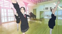
The Murder Case of Hana & Alice (or just simply The Case of Hana & Alice) is a prequel of a 2004 live-action movie Hana & Alice. The film divides into two separate parts, which contains even different sets of characters besides the titular Alice. We follow every steps of Alice as she familiars herself with the new environment in the first part; noticing the mysterious neighbor who spied on her (that would be Hana), being bullied in class for breaking the “curse seal”, having a chance to play ballet, meeting her father, participating in relay, and investigating a superstitious “murder case”. The second half we have her teaming up with Hana in an attempt to find whether the real victim was dead or alive, which leads to the many misadventures along the way.

If there is one thing that you immediately notice while watching this film is that the film looks and feels more like a live-action movie than anime. This is true in a sense since the director Shunji Iwai is famous for his live-action films and The Case of Hana & Alice was his first anime attempt. The shots compose is more of live-action sensibility than animation as well. Take for example the motifs of tracking the characters walking through the streets in a profile shot; while we have that kind of shot in anime, it’s usually used very quickly to show the characters talking to each other. Here in the film they use a good 10-20 seconds just to follow those characters literally just walking, either alone or together. The character designs, since they are modeled from real actresses, look more realistic than our usual anime designs. The color is always on bright scheme, with the mixture of real life building and pink/green-dominated background. It produces a more impressionist look and honestly I like the look of the movie. The music is easily one the best component out of this film, which composed by the director himself. It contains both piano score and violin score resembling a ballet score. If you close your eyes and just listen to the music, you can really feel the flow of the music and the mood it creates. It’s that good.

In addition, the decision to make this film an animated one was more of practical choice than artistic choice. The director wanted to use the same actresses from the original movie to display an even younger version of them, as a result he had to use rotoscoping to avoid ageing the actresses. To put it simply, rotoscoping is a process of filming live action footage (with real actors of course), then retrace it frame by frame by either re-drawn it or using computer software. Rotoscoping has been used before in anime, quite controversially even, in Flowers of Evil, to suggest an eerie and uncomfortable sense to our viewers, but in this case, the use of rotoscoping produces a very different outcome: a floating sense. That floating sense plays both as its strengths and as its shortcomings. On a plus side, this suits the most for ballet dancing, since you know, ballet dancing is already like floating across the floors. Many of the ballet sequences are easily the highlights of the movie, both visually and as a statement of how to use the technique right. On the negative side though, the weight of the characters always seems off, as a result we feel the characters “just floating” in many moments, most noticeably the first sequence where Alice falls off from her window and was “catch” by the worker, or later whenever Alice’s running. On other notes, the disparity between characters who were drawn from actual actors and those fictional characters is just jarring. The designs of the worker mentioned earlier or the triplets with bikes in the end felt really like they came from Tintin universe (with big-dot eyes and cartoon face) and to put it together with a much more realistic designs of the mains, you feel like you’re watching two different movies at the same time.

The biggest selling point of the film is, of course, the characters themselves and the dynamic between the two main girls. On that front, the film shines the brightest. This is the kind of characters I love to follow, not because they are the deepest, but because they’re full of identity. There are many vivid little moments that showcase this quality, as mundane and realistic as possible. From Alice punching the book written by her mother in a bookstore, to a moment where she found the last piece of snack, to the moment where the two girls practicing ballet out at night. Make no mistake, the staffs really love their characters and we feel that love throughout the movie. They are not your typical teenager high school protagonists, Alice is a girl that acts on impulse, she’s direct and doesn’t afraid to speak her mind; but she’s surprisingly down to earth and sincere as well or Hana is not your typically shut-in character, as she’s actually smart and quick-wit, and her guilt that she might be responsible for the death of her close friend makes her a more realized person than most other main characters we see in anime shows. Furthermore, they bound off each other very well, mostly because they have so different personalities, yet they can share the pain to each other. The other side characters, in general, provide enough charms and again, “personality” to make them stand out too: Alice’s mother is wise enough but often shown as childish, Mu is fantastic with her unique-but-nonsensical quirks.

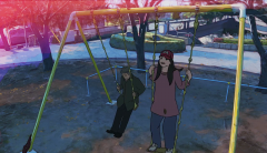
Another note that I find really interesting is that the whole film is decidedly female-centric cast, with the men only appear as either faraway (both Alice’s father and Yuda) or as weak and dependent (Alice’s father mentioned that he didn’t have a mindset to become a top runner, the bullying boy who reveals that he does it to save face, Yuda who is insecure about love and the idea of commitment). The only real male cast that was portrayed in different light is the old man. He’s representing the contrast between his old-self with the youthful, full-of-life of Alice. The sequence that speaks best to that idea, when Alice playing on the swing, stating how long it has been since her last play (2 years), the old man just sits quietly there in the next wing, his body feature looks no different than the old man in Ikuru, he told her that it has been 40 years since he played, because it was the time when his daughter was still in elementary school. This sad, melancholic tone mix in so well with the youthful of Alice. This is really the heart of The Murder Case of Hana and Alice- a film that celebrates the youthfulness, of how it’s like to feel young and enjoy the little moments of your life.

It’s criminal that The Murder Case of Hana & Alice slipped under the radar of most of anime fan. Surely it doesn’t look like your typical anime but I will say that there won’t be any anime like this in the near future. This is a rarity even among anime fandom. I haven’t watched the original live-action film, but surely after watching this I’m eager to check out the movie, just so that I can spend more time with those characters again.

Next post I will review the best written anime movie out of last year. And this time it might be the one you think it is. Stay tune!

~SuperMario~

My Life as a Courgette (2016) Movie Review – 82/100

It’s never easy to make a good family’s animation. For movies aim at adults, the filmmakers can easily get themselves loose, go crazy and the audience can still get it. But for kids, these movies might be one of the first movies they’ve ever seen and that’s a huge responsibility. They have to aware of children’s mindset all the time so that they both maintain kid’s interest throughout its screening time and make them invested to the story. That’s a reason why usually a good family movie or show tends to be either inspirational, educational, or packs an emotional punch for viewers of all ages. My Life as a Courgette falls neatly under the latter category. The film is adapted from a French children novel and the screenplay was written by the talented Celine Sciamma (she directed handful of movies and all of them focus on teenage girls and their transitions to adulthood, in other words, my kind of films). Though not as dark as the book, it’s a story from a kid’s point of view that have a very adult concept and tough subject matter.

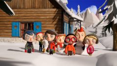
The film recounts a few months in the life of Courgette, a nine-year-old boy, who accidently kills his alcoholic mom, then finds himself in an orphanage. His real name is Icare, but he insists of calling himself Courgette since it’s one of the very few things that he has left from his mother. Indeed, when he steps into the orphanage, the only things he keeps in his suitcase are an empty beer can from his mother, and a kite he made by himself. He doesn’t remember much about his father either, since the father left the family long time ago to chase “chicks”. There in the orphanage, he, still feels responsible for the death of his mother, encounters other kids who – like him – had experienced rough childhoods. They include the self-appointed leader (and a bit of a bully) Simon, and later Camille arriving by court order, who witnessed her parent’s murder-suicide. Rosy, whose mother was sent back to Africa. Ahmed, whose father was arrested for robbing a convenience store. Alice, whose father was arrested too. There is also a kind-heart policeman Raymond who later would be Couragette father’s figure as well.

If you feel I give a bit too much of a synopsis here, this is because it’s essential to the theme of the story. The best thing about the film, I have to say, lies in its sensitive writing. Within the first 10 minutes, the film successfully establishes a solid ground of all the mishaps, all the sadness these children have been gone through. Those moments feel so real and hold so much power. Life is not fair in the first place, and those children did nothing to deserve it. They all end up here, without the care of no one really, and all they have are each other. Being said that, those sad, downbeat times are just a facet of life, and learning how to live with it is the main theme of the film. The later part of My Life as a Courgette comes to more light-heart, sincere territory, but by then we’re already swept by the sadness that the whole movie feels more like a bittersweet experience.

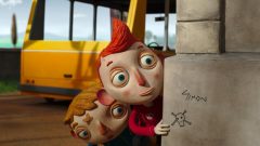
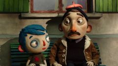
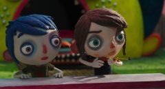
Upon making this feature, the director Claude Barras insisted that he took extra attention to the eyes of the characters, and it shows in the movie, as the characters have big, expressive eyes. In many of the touching moments, those eyes help conveying a lot of emotion and we really see the sadness behind those eyes. The character designs, with big head, multicolor hairs and very thin body, further make those characters easy to root for, and will definitely catch the interest of the children. It helps of course that the kids were well-written and speak like a normal 9-year-old would speak. The stop-motion for the most part is serviceable; they serve the story well but nothing to stand out and truthfully judging from technical aspect there is nothing to recommend either. Then again this film is a children movie so I guess it serves its purposes.

If there is one thing that I could criticize the film for, that is its conflicts resolve way too quickly. There are two main conflicts of the film. The first conflict comes from Simon bullying Courgette, both because of his name and because he’s new. The second comes from the group’s attempt to win back Camille from her aunt who intends to use the girl for government-aided. I really think more time spending to raise the stakes would benefit the film better, especially with its relatively short running time (66 minutes to be exact). Because of its brief running time, only Courragette and two more characters (Simon, Camille) have a chance to develop, and boy! They certainly grow a lot during their brief time staying together in the orphanage.

In the end, My Life as a Couragette is the kind of film that the kids can enjoy but there’s a level for adults to appreciate as well. The bittersweet moments are all well-earned, and this is a feat to tell a sad, dark story without being too cynical or depressing. The film actually suggests the opposite, that unfortunate things happen everywhere, but learning to bounce back and stand up from those mishaps is something worth treasuring for.

Next post I will review my personal favorite anime feature film that came out last year in 2015, and it is NOT the one(s) you think it is. Stay tune!

~SuperMario~

The Red Turtle Review – 93.5/100

Welcome to my first movie review on World Animation section, the column where I wholly dedicated to indie/ art-house animated features around the world that hardly got coverage anywhere really. And what’s a better way to start this section by reviewing one of the most talked about animation movie this year, the one that I believe will continue to gain more devoted fans for years to come. The one that debuted back in Cannes this year with rave responses. Yes, let’s get to The Red Turtle today.

The Red Turtle is a brainchild of the director Michael Dudok de Witt and Studio Ghibli. If you never heard about the director, he’s an auteur animator who directed award-winning shorts Father and Daughter, the short was so acclaimed that many big animation studios approached him to direct their blockbuster movies, all of which he declined. Then one day he received a letter from Ghibli Studio stated that they thought his shorts looked very Japanese and they wanted to make a film with him. If you think the involvement of Ghibli could make this movie a more anime influences, you got yourself in a bind there, because this is unmistakably a Dudok de Witt film with more of European arthouse sensibility, with the slow and deliberate but confident pacing, and the film is more about sense and experience and many details are more open to interpretation than offer any precise meaning.

Looking from the outset, the film sounds like a really challenging work. This is a dialogue-free film about a man who washed away to a deserted island. He tries every opportunity to escape from the island, but always get disrupted by the giant red turtle. Then the man and the turtle form a closer relationship to each other and ultimately the man finds a way to adapt to his new life. And that was just the first 15 minutes of the film. For a full length feature film with no actual dialogue, it’s a feat that the movie maintains the attention to the very end. Indeed, trying to explain the plot of a film, or trying to recapture it in words, is already a disservice to the film. The Red Turtle is a film in its purest form, a visual storytelling that will lost its impact if it gets portrayed in any other forms.

Apparently, Dudok de Witt initially planned to have a main character to speak to himself, like what Tom Hank character did in Cast Away, but then he scrapped the idea since he felt that the dialogue (monologue?) was too unnatural. But without dialogue doesn’t mean this is a silent movie. The sound of the movie, that include both natural sound and the score, is one of its greatest achievement. The sound helps assist us to follow every steps the main character takes, really put us in his shoes as we follow him around. Those sounds create a whole surrounding very detail too, close your eyes and you can hear the wind breezes, the waves of the ocean, the steps of the man and those animals at the same time. The score is equally impressive, at most times it’s slow and tender, but other times thrilling and exciting (like the very first scene or during the flood sequence). Visually, Dudok De Witt implies a very plain character designs against a natural but well-detailed and rich world the main characters inhibit. The background is expressive, with too much details was put on it. From the bush trees, the little crabs who seems to follow the waves, the baby turtles go around the bench, all these really create an atmosphere to the island. The animation and the shot selections are all top-class, which holds much of our attention throughout its 80-minutes length.

The film maybe about a man who float in an island, but the plot never feels plotless. Everything happens contribute to the main themes, which are the connection between human and nature and the passage of time. The film chronicles the man who struggles to find a place in a nature that clearly not for him, to him having a family and has something to hold on to. As the man got older and wiser, he himself realizes he’s just a small part of the world, like every plant, animals around him. His passed away in the end is just as well a part of that cycle of life.

It’s rare today that can give a work that are original, mature and ambitious as The Red Turtle, especially against the backdrop of the dominance of computer animation in feature-length movies for the last 20 years. The Red Turtle, with its simple hand-drawn techniques, already feels like a timeless production, and the film is even more significant given the fact that this is co-produced by the beloved Ghibli, now on its semi-hiatus phase. While this film bears little resemblance to Ghibli’s original outputs, this is clearly a production of both the director Dudok De Witt and Ghibli; in a sense that The Red Turtle would not exist without those two. With so much efforts were put on this picture, it’s the more astonishing to realize that the film had achieved something so difficult to attain: simplicity.

Next post in this column I will review the film that just won the Annecy Festival this year. Stay tune!

~SuperMario~

Chinese Animation Guide – Part 4: Chinese Traditional Animated shows

Welcome to the last part of our Chinese animated guide. This part will cover Chinese traditional art style, for me personally this is the most enjoyable group. The first thing you might notice in these shows are they were in different format ratio, lean more towards the Academy ratio format. I always find their traditional art style more compelling, but somewhat conservative approach (since for long decades the Chinese insist to use this style over and over again). Luckily, these restricts have been loosen up in recent years without locking into any particular one style. As a result we have those shows below as a more relaxed and more updated version of their traditional style. Here are again the 6 shows in no particular order:

Romance of Three Kingdoms (三国演)

romance of 3 kingdoms

This is a 2009 Chinese adaptation, so not to be confused with the various anime versions. Based on the popular work “Romance of Three Kingdoms” (which people regards its influence in East Asia literature is like that of Shakespeare in English literature). What we have in this episode are the three legendary warriors Liu Bei, Zhang Fei, Guan Yu become brothers and they fight together. I love the traditional character designs, and they provided solid enough animated scenes. But I can’t get pass the fact that a girl who was pushed down a cliff, not only she’s not die, but seems unharmed and she then proceeds to play musical after that. Weird. She must had been on crack I think! Besides that, I always meant to read the actual book, but its length (800,000 words) always put me off. This series so far is solid enough for me to follow it through.

Continue reading “Chinese Animation Guide – Part 4: Chinese Traditional Animated shows”