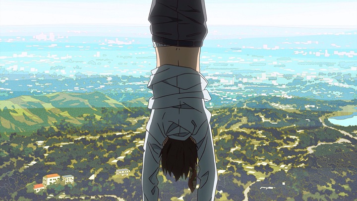
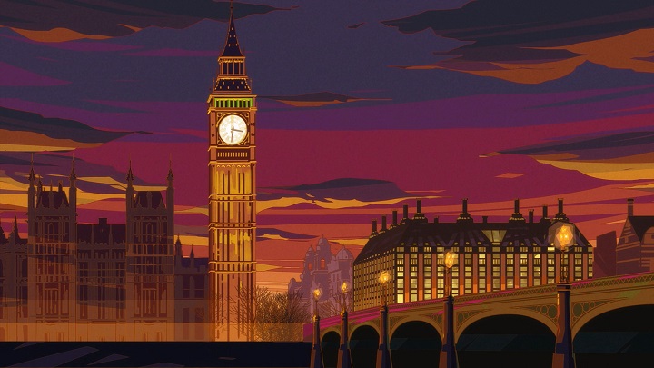
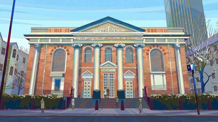
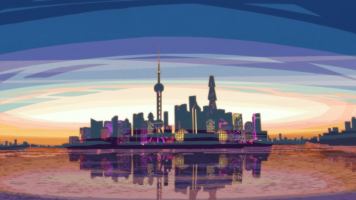
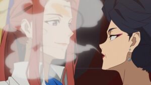
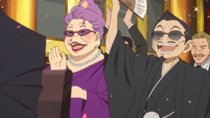
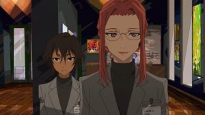
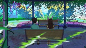
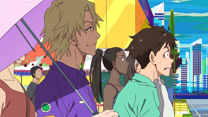
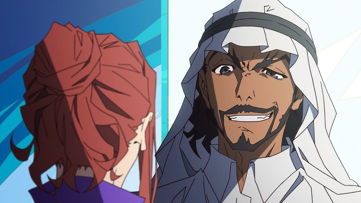
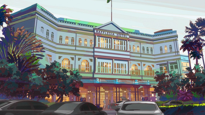
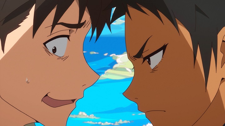
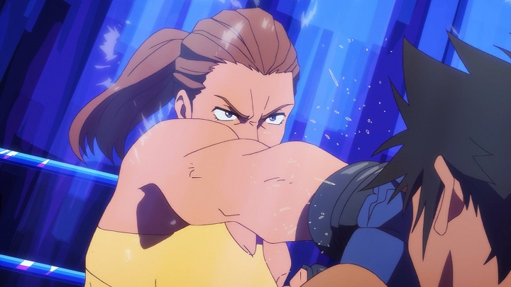
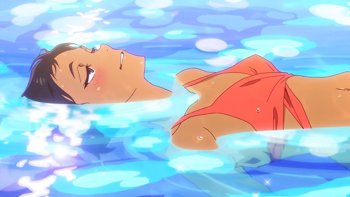
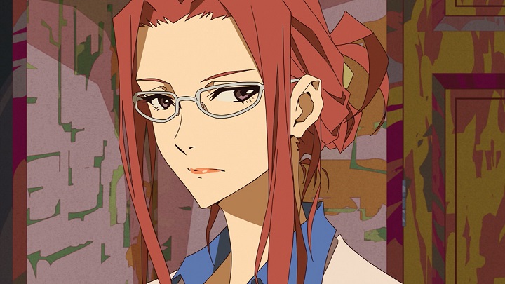
From an aesthetic point of view, Great Pretender is my favorite TV anime of 2020. I’ve spoken plenty about art director Yuusuke Takeda in previous posts, but since this is the last time I’ll be writing about this show for the blog, allow me to recap: he’s one of the best and most prolific visual designers in the industry today, and Great Pretender is one of his most striking works. His brash juxtaposition of color was a great fit for such a sharp, fast-moving series – as were the angular designs of legendary character artist Yoshiyuki Sadamoto. Tasked with creating an entirely adult cast, he opted to give them prominent noses and messy hairdos, incorporating plenty of detail while still allowing the animation team room to breathe. They did their nimblest and most acrobatic work in the show’s first arc, but even as Great Pretender settled in for the long haul, it maintained a sense of liveliness sufficient to absorb you in its story.
So why the caveat that it’s my favorite only in aesthetic terms? What disqualifies it from being the runaway AOTY that I initially hoped it would be? And on the flip side, what does Great Pretender do right that most other series wouldn’t dare to attempt? Read on for one man’s thoughts on one of the year’s most original anime.

